Build an Agent for Data Visualisation: Plotly.js + Gemini
This might be a side project stemming from my previous text2SQL project. It might not seem new to the community (probably something that should've been posted 6–12 months ago), but it's still a great recap of the exploration :)
Disclaimer: The content comes from self-study, rather than anycompany project code.
Problem Definition
Let's dive into the part that matters most for a data scientist — problem definition:
I aim to develop a solution to visualize the data queried by a previous SQL generation agent. Here are the key requirements:
- Chart Type as Requested: The visualizations should align with the chart type specified by the user. It should support line chart, bar chart, histogram, scatter chart, heatmap, pie chart and so on. There might be more than 1 chart type in one plot.
- On-Demand Visualizations: Visualizations should only be created when explicitly requested by the user.
- Minimising Steps for Visualisations: Due to certain project constraints, we can't set up a safe sandbox to execute Python code generated by an LLM. So, we need a way to achieve the final visualization in just 1–2 steps, without relying on additional Python function execution.
- Error Handling: My end users have low tolerance for unavailable or malfunctioning visualization features.
- (Nice-to-Have) JavaScript Visualizations: Ideally, the visualizations would be in JavaScript format so they can be rendered directly in our data application. This way, users can interact with the charts easily instead of dealing with static images.
Proposed Solutions
With all these considerations, there are some tools or techniques that seem suitable for this case:
- Visualization in JavaScript: Plotly.js offers powerful, interactive charting capabilities directly in JavaScript.
- Structured/Controlled Result Generation:
- Pydantic-AI provides a way to ensure structured outputs from AI models, helping to maintain control and reliability.
- Google Vertex AI's Generative AI also supports controlled output generation.
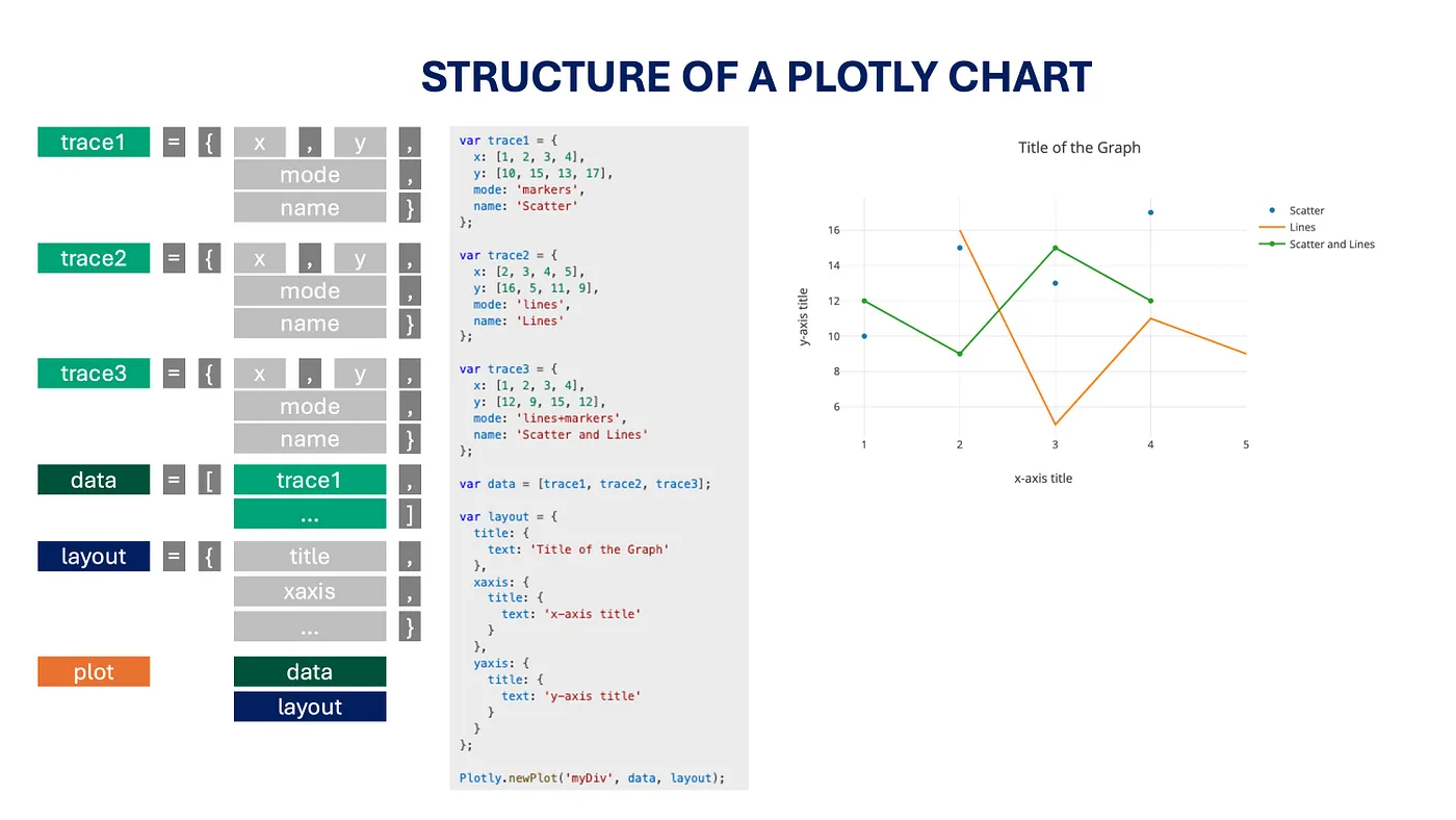
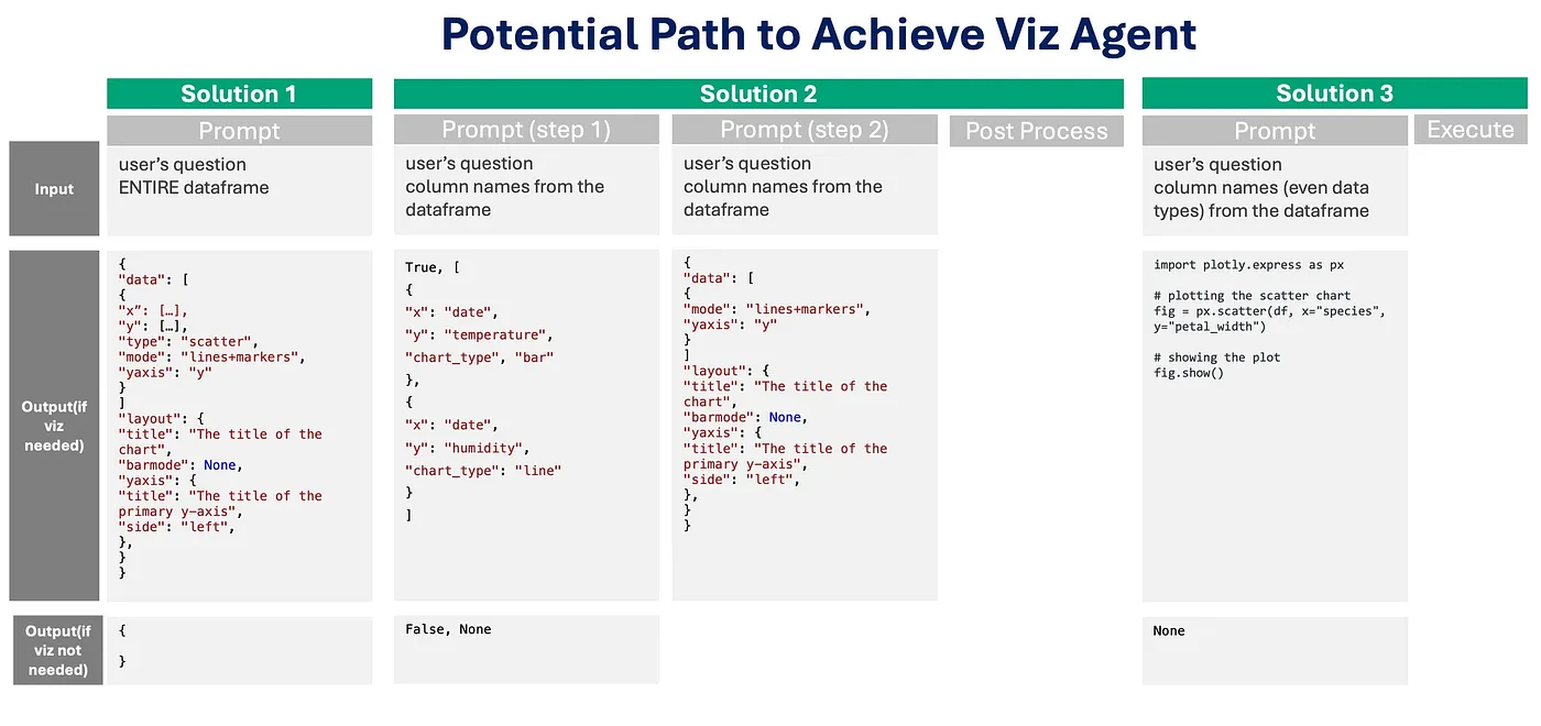
It's easy to find that the Plotly.js code is pretty structured, suitable to abstract as some response schema, and we use the code to render the plot directly. There might be 3 solutions come to my mind when I want to develop a Viz Agent:
- Single LLM Call for Direct Plotly.js Config
- Two-Step LLM Interaction for Plotly.js Config (with Rules in post processing)
- LLM-Generated Python Script for Static Plots
However, later we noticed:
- Though Vertex AI claims it supports multiple data types in the same field, in reality, it only supports one type as a string. However, our data can be strings, floats, or integers.
- Sending all data points in the prompt might require many tokens, which could be wasteful. Additionally, considering data privacy, it's better not to send too many data points to the LLM directly.
It's worth noting that Solutions 1 and 2 assume the data passed to this step is already processed and ready for visualization. Solution 3, on the other hand, provides more opportunities for data aggregation or transformation before generating the plot.
Implementation Details
Next up: I'll share more details about how I employed Solution 1 and its implementation.
1. Visualization Decision Logic
How to decide whether we should visualize or not:
import vertexai
from langchain.chat_models import ChatVertexAI
from langchain.prompts import ChatPromptTemplate
from langchain.chains import LLMChain

# Configure your environment
PROJECT_ID = "xxxxx"
LOCATION = "xxxxx"
MODEL_ID = "gemini-2.0-flash-exp"

vertexai.init(project=PROJECT_ID, location=LOCATION)

# Create the LLM object using Google Vertex AI
def create_langchain_llm_controlled_generation(response_schema):
    return ChatVertexAI(
        project=PROJECT_ID,
        location=LOCATION,
        model=MODEL_ID,
        temperature=0,
        response_mime_type="application/json",
        response_schema=response_schema,
    )
2. Response Schema Definition
response_schema = {
    "type": "object",
    "properties": {
        "visualization_needed": {"type": "boolean"},
        "visualization_type": {
            "type": "array",
            "items": {
                "type": "object",
                "properties": {
                    "x": {"type": "string"},
                    "y": {"type": "string"},
                    "z": {"type": "string"},
                    "chart_type": {
                        "type": "string",
                        "enum": ["scatter", "line", "bar", "histogram", "pie", "heatmap"],
                    },
                },
            },
        },
    },
    "required": ["visualization_needed"],
}
3. Prompt Template
prompt_template = """
You are a data analysis expert.
Your task is to analyze the user's question and determine whether we need a plot for it.
Analyze the provided question:
<Question>
{question}
</Question>

The columns in the given dataframe is {data_cols}

You should decide:
1. Does the user explicitly indicate a desire to visualize a chart, graph, or diagram?
2. If a visualization is needed, what type of chart/graph would be most appropriate.
"""
4. Example Configuration
config = {
    "data": [
        {
            "x": [1, 2, 3, 4],
            "y": [10, 15, 13, 17],
            "type": "scatter",
            "mode": "lines+markers",
            "name": "Dataset 1",
        },
        {
            "x": [1, 2, 3, 4],
            "y": [16, 5, 11, 9],
            "type": "scatter",
            "mode": "lines",
            "name": "Dataset 2",
        },
    ],
    "layout": {
        "title": "Example Chart",
        "xaxis": {"title": "X Axis"},
        "yaxis": {"title": "Y Axis"},
        "plot_bgcolor": "rgb(248, 249, 250)",
    },
    "config": {
        "responsive": True,
    },
}
Conclusion
With these implementations, interactive plots can be seamlessly integrated into your data application. The solution provides a robust way to generate visualizations while maintaining control over the output and ensuring a good user experience.